Sunday 29 March 2009

Visual language - Self evaluation.

I really struggled at the beginning of the 'What is a line' project, I was confused as to where I wanted to take it and wasn't really enjoying it. I kept putting it off to a point where I actually went a few weeks without even touching it. This did result in my work suffering. It got to the point where it was 3 weeks before the deadline, and I was still confused as to which direction I was going to take it. I had somewhat final ideas but they were in completely different subject areas. The crit helped a lot though and pushed me into a final stage of work. I know one of the reasons for this was that I didn't chose a specific statement at the beginning, I started by looking into all the different interpretations and ways I could take them which made it harder to chose a direction. I should of made decisions sooner and limited myself to a specific area of work.

I really should of managed my time better during this project too. As it was an ongoing project, and was going on while we had all the short briefs to do, I felt that the other briefs were more of a priority, and because it was a long project I thought I had time to do it. I really didn't. I should of taken time out more regularly work on this project. I'm now at the very end of this project, and although I have a final piece, there are so much more ideas and developments I would like to do, but now don't have the time.

When it did come to a point where I had chosen a direction, I thoroughly enjoyed doing it, and was happy with the work I was producing, but then I hit a brick wall. I didn't realise we had to come to a final outcome, and that our work needed a context and audience, I thought we were just handing in a body of work which was quite naive of me as we are on a graphic design course after all. I overcome this though and produced a final piece I am very happy with.

Although I did push myself towards the end of the project, I really wish I had put more effort in at the beginning. It would of given me more opportunity to experiment into my final idea, and improved my final outcome.

I wrote all this before I found out we had to fill in a self evaluation sheet, so here it is anyway. I apologise if I repeat some points I've discussed already.

What skills have you developed through this module and how effectively do you think you have applied them?

I have learnt the basic skills of drawing perspectives. I now know about vanishing points and can apply these skills to basic shapes as well as type. This is now something thats always on my mind when drawing.

This module has given me the opportunity to enhance my drawing skills. I feel a lot more confident about drawing now, and can draw more freely, whereas before I was very rigid and worried about who was going to see it rather than just focussing on getting my ideas down.

I have learnt about how to find different ways to represent a word or an action. This has enabled me to think outside the box more and opened my mind to different possibilities.

My confidence has improved dramatically when it come to presentations. At the beginning of this module, I was very nervous about presenting and talking about my work which resulted in stuttering a lot, and basically completely forgetting everything I wanted to say. Although I still get nervous, obviously, I feel more confident and am able to talk more freely. I feel this is shown in the last presentation, where we had  to present our work for 3-5 minutes. Normally, I wouldn't have spoke for very long, but I managed to go over 5 minutes without even realising. I was quite happy/proud with how this went.

Also, my photography skills have developed dramatically. Even though I'm still struggling, I now have more knowledge and confidence than I did before this module. I am now renting out cameras more regularly, and using it as much as I can. I feel these skills are shown in the photographic documentation throughout my blog.

What approaches to/methods of research have you developed and how have they informed your design development process?


What strengths can you identify in your work and how have/will you capitalise on these?

The way I have constantly documented my progress throughout this project. I have kept an ongoing diary on my blog, documenting my thoughts, opinions and reasons why I have moved on from a particular piece of work. It really helped me manage this project in terms of helping me make decisions based on points I've said and rules I've stuck to.

What weaknesses can you identify in your work and how will you address these more fully?

Time management. I know I keep repeating myself but it really was an issue within this module. I plan to start doing more time management sheets and sticking to them. I will use all the time we are given for a project appropriately, starting it when we get it, and not pushing it to one side to complete other briefs.

I am very indecisive, and this let me down in the 'What is a line' project. At one point I was tackling two different pieces of work just because I couldn't decide which to do. If i'd of chosen sooner, I would of had more time to develop my final outcome.

I also need to work on putting my ideas down on paper quicker. During the lessons with Lorenzo with the icons and pictograms, I was too busy making sure it looked good, rather than concentrating on getting all my ideas down. This is also something that has let me down in other modules and I plan to resolve it by trying to work more freely, and also by working in pen straight away. That way I can't rub it out.

Identify five things that you will do differently next time and what do you expect to gain from doing these?

1. I know I keep mentioning this, but I really need to manage my time more effectively. I should start the project as soon as I'm given it, we're given that amount of time for a reason.
2. Do more design sheets. Although I feel comfortable working in a sketchbook, I feel I would benefit from working on something of a larger scale.
3. Start thinking about audience and context from the beginning. This way I will be able to make decisions based on what's relevant to the context.
4. Take even more photos of my work. When gathering all my work at the end of this project, some was missing and unfortunately I have no photographic record of it.
5.

How would you grade yourself on the following areas:
5= exellent, 4= very good, 3= good, 2= average, 1= poor

Attendance: 3
Punctuality: 4
Motivation: 4
Commitment: 3
Quantity of work produced: 2
Quality of work produced: 4
Contribution to the group: 3
Final poster.

I'm very happy with it. The join between the seperate colours almost create an ongoing line throughout the whole alphabet. 

Playing with layout/colour.


I have decided I want to keep with the green/blue colour theme to relate to maps.

Saturday 28 March 2009

It's about time.

A complete alphabet.
Very happy with how this has turned out. The letters are clear and recognisable, which is one of the things I was worried about. I think they work really well together.

Monday 23 March 2009

Illustrator.

Based on the existing typeface, Century Gothic, as I wanted a very round, bold, smooth finish. And also more of an area to work with.


I haven't stuck exactly to what I was doing with the books, I have added more lines simply to make the letters more legible. 

I've been thinking about audience too. I think this typeface would be most suitable for designers, or more specifically architects, or just simply anyone who works with technical drawings.

Sunday 22 March 2009

More contour type.

But this time with more colour.

Just the same as before but bigger and with more colours. In the crit it was suggested that I experiment wit colour more, and I wanted the lines of the contours to be more defined.


Again, I put the contours back together to make 3D type. 

I love how they work when they are put back together, and would really like to create a complete typeface based on these letters.

Saturday 21 March 2009

Contour type.

Putting the contours I'd cut out back together. It was suggested that I try making it 3D in an earlier crit.

I really like it. It was very fiddly though but successful, and I plan to develop this idea further.

Contours combined with type.

Based on the existing typeface, Helvetica.

Just doing the same as I have been doing, only using type. 


Really like how this has turned out. It almost works as a flip book too; the letters deteriorating as the book progresses.

Matt Shlian

Becca found this artist for me, Matt Shlian, and I found this piece which is basically what I've been wanting to do in terms of combining type with the contour book idea.

Tuesday 17 March 2009

Final Crit.

Ok so, had the final crit today, and everyone in my group basically said that I should continue with the books. When I asked about context, they suggested that I make a set, have the books as a collectors item, something as a keepsake that you'd just look at every so often. I like this idea, however, I don't feel I now have the time to complete a set of books, not to the standard I would want them anyway.

A way around this would not to make the lines as thin/detailed as I have been doing. So, basically use less paper so there's less cutting involved.

As for the typography idea, no one seemed to think it would work. This is, however, the direction that I would really like to go in, and I am determined to make it work.

What is a line? - Rules.

Rules:
1. Stick with contour lines.
2. Limit myself to just using typography.
3. Experiment with colour.

Where I'm going...

Ok so there's 2 main ideas I'd like to do but I don't know which one to chose.

First Idea
Go back to the continuous line work I was doing earlier on in the project and put them into a book. So it would have a continuous line going through the book.

Second Idea
Continue with the contour lines and either carry on with the books or develop my own typeface inspired by the research into fonts I did earlier in the project.

Really confused about which one to go with. I think I would like to continue with the contour lines and maybe find a way to combine both the typeface and book idea.

Saturday 14 March 2009

Map of Doncaster.


Ok, I really like this but I'm really struggling to see where I could take it from here.

Thursday 12 March 2009

Digital Photography Elective - Week Four.

Lighting Studio.

Really enjoyed this lesson. We were able to get on with what we wanted to do, and everyone seemed to go off and take pictures, so me and Ed practically had the big lighting studio to ourselves. I didn't have any objects with me, and the only thing in the studio that was remotely interesting to take photos of was the chairs. It was really nice to play about with lighting, I focussed on creating shadows, and creating a quite atmospheric photo, which I think I've done quite well.


Got a camera out for the week so I could carry on taking photos with flash, tried taking a few photos on the way home and realised the flash is broke, pretty annoyed. 

Tuesday 10 March 2009

What is a Line? IX - Map Tracing.

When I was looking into lines of maps, this is something I wanted to do but had been too busy concentrating on the contour lines. Then it was suggested in the crit to back and investigate it further.

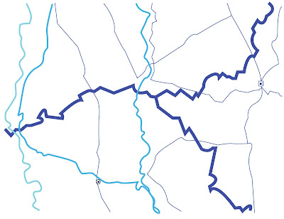
I've taken one of the photos I took of maps into illustrator and traced over the lines. I've took into consideration the thickness of the lines and added a little colour to make it a bit more visually interesting.

I first tried to use minimal lines, which I liked, but felt it needed more. 


I really like them, especially the contrast in the thickness of the lines and the delicacy. It has more of a context than the contour lines as the lines are actually taken from a map. This is something I could do with my contours, take them from something so I'm not just making them up. I would also like to look at a map that means something to me, such as my hometown, Doncaster. 

Monday 9 March 2009

Contour Map Book.

Yep, another one.

I bought an A3 road map book, cut out the pages and bound them. This time, however, I didn't cut out circles, I just cut out the lines. My aim was to produce something with a bit more colour, something that would define the lines more. It has worked, and I do like it, I'm just really confused as to wether I'm doing the right thing for this project. It still doesn't have much of a context/audience which I really need to start thinking about.


Print induction at Blenheim.

Sunday 8 March 2009

What is a line? VIII - Contour Book.

This is the finished contour line book that I'd been working on for a while.

I really like how it's turned out, it does look like contour lines and the lines are really thin and delicate, like how they are on maps. I now plan to experiment with colour and have bought a pocket map of the world book which I have yet to experiment with.

When I look at the book, however, I realise it has no context. It doesn't represent anything or mean anything and I'm really unsure of how I can get around this. I mentioned this in the crit and it was suggested to me that I go back and develop the lines from maps that I were experimenting with earlier in this project, but I feel like I would just end up in the same position, and I would really like to continue to develop the contour lines. I have re-read the brief and it doesn't say we have to have a final resolution for this project, so I'm going to continue to investigate the contour lines and find a way to give them more context. However, I can't help but wonder if it actually needs a context.

Tuesday 3 March 2009

What is a Line? - Presentation & Crit.

Had the 2 minute presentation and crit today which didn't go as well as planned, in terms of my presentation I mean. I missed out a lot that I wanted to discuss because I was nervous.

Everyone wrote down 5 questions and they've been really helpful. Here's some of the questions I was asked that I plan to take on board:

Have you tried creating type from the pages?

Have you experimented with different coloured paper?

Could you try cutting lines out of other things other than books?

Could you create a 3D object instead of hollow?

Have you looked at buying a map book and cut the shape of a map or a contour out?

Have you thought about the last page (uncut) being an image?