Thursday, 23 October 2008

Violet Violet Violet.

What is violet?

I really haven't been very well this week so i've found it really hard to get into this brief, which is a shame as I found it really interesting. However, I could carry it on through reading week to get the most out of it.

A concept which I have been experimenting with is how violet is made; the mixing of the primary colours, red and blue. A literal approach yet i've found can be really effective. I've been using seethrough objects to convey this, one thing i've found quite successful is feathers.

I was quite unsure as to how this would turn out at first, but the violet is actually really visable. I really love this image and think it answers the question "what is violet?" very well.

There are a few other concepts which I like but have yet to develop a bit more. One which I really like is showing the shades of violet, starting from the reddy voilet through to the bluey violet. I have experimented with text for this but have ideas for images which I feel will work a lot better.

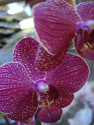
When researching violet I found various references to flowers, so during reading week I took a trip to the garden center where I took numerous photos of different brightly coloured flowers. I've picked out a few of the best ones.


I particually liked this one of a violet pansy, so I've used this photo to experiment with all the shades of violet.

I know it's not brilliant, and all i've done is replecate an image, but I like it. It's simple and it gets to the point.

Sunday, 19 October 2008

Screen Printing.

I have done screen printing before but the equipment at our college wasn't half as good as what it is here. I really enjoy it, I love the outcome of it. I think what I like the most though is how much work you can produce in so little time lol.

We started off by picking the piece we liked best from last week which included quite a lot of contrast, then photocopied it twice. The first copy would be our first print (magenta), the second was for us to edit and then used as the second layer (cyan) of our print.

Our first prints...

I really liked the first set of prints even though they were just replica of my chosen print. I just like the simplicity of one colour, and the texture it's created.

The edited piece..

I would of liked to of done a lot more to this but unfortunately I didn't have enough time. Maybe i'll go back some time soon and have another go.

I don't know who it was who took a picture of me with my camera, but thank you =) lol. I actually found it quite hard as I couldn't reach the other side lol.

The final outcome..

I'm not entirely pleased with the outcome. Like I said before, if i'd had the time theres a lot more i'd of edited to the second piece so that more of the magenta would of shown through.

I will definately be using this process in future projects.

Alphabet soup pt.2 - Jonny's Font.

For this 2 week brief, we each had to create a typeface which reflects our partners personality. My partner was Jonny.

The words I had which described Jonny were confident, funny, opinionated, artistic, organised, temperamental, chatty, contemplative, indifferent and amusing. I realised I couldn't include all these characteristics as some condradict others, so I put them into groups of which I felt fit together.

Artistic was the easy one, it could be pretty much anything, but I came up with a paint brush and the marks which it makes. For example...

I wanted this to be the fill for my letters but as our final a1 piece had to be traced, I realised this would prove a lot harder that I thought, so I decided not to take it any further. Though I will experiment with this technique when we digitalise our work.

I was struggling to come up with ideas so I looked in the thesaurous for words which related to the words i'd got. This would also give me an in depth understanding of the words. For indifferent I got unconcearned, casual, relaxed, laid back and easy going. When thinking of relaxed/laid back as a typeface I thought of itallics, so I began experimanting with the angles of the letters. As a result of this I ended up making only half the letters itallic to create the idea of the letters literally being layed back. Instead of the itallics leaning to the right I lent them to the left to emphasise them being layed back. It's really subtle yet I feel it's really effective.

One of the words I found for organise was frame, so I used just the outline to frame the letters. I am a little unsure of how frame can represent organise though. I also used capitals to show maturity and confidence.

Here's my final outcome...

I am pleased with the outcome, though I feel it would of worked a lot better if the outline was thicker. This way I could of shown confidence more effectively. I also feel I should look more into the angles of the letters as some aren't as successful as others. This was the major problem when creating these letters but I thought the best way was to keep every angle the same no matter what the current angle was. I think I overcome this problem quite well I just feel I need to look more at the O and Q, and possibly the X, which will be a lot easier to do on illustrator.

I felt my typeface worked particually well on the name badge. This proves that the typeface is practical/functional as well as aesthetic.

As for my partners typeface, I feel he put across my personality really well. I especially liked the dashed/incomplete lines to show that i'm shy. Jo made the point of saying I was being a bit too generous when it came to the crit, but I actually really liked it.

The only issue I had was that it didn't work as particually well on the a1 sheet as he seperated the letters. Whereas on the name badge he joined the letters and where they crossed/overlapped was the confident part of my personality showing through.

I really can't wait to get all my letters onto illustrator. I will put them up as soon as they're done. =)

Wednesday, 15 October 2008

Si Scott.

Looking back at my blog I realised I hadn't really got much work up by other designers. So thought I best add some more.

So why not start with one of my favourite designers, Si Scott. I absolutely love his work. And what makes it even more interesting is that it's all hand drawn. Take a look at his website http://www.siscottstudio.com/, theres a video on there of him producing some designs. It also mentions he's done talks and presentations at Leeds College of Art & Design, I don't suppose we could get him to come down again? lol.

Accept and Proceed Logo

Orange

I only hope that one day I could produce something as amazing as this. =)

Monday, 13 October 2008

Colour Theory.

My colour was purple.

The mess we started off with...

We were confused at first as to how to catogorise them, so we looked at the type of colours that we'd got. We arranged them into 4 piles, the light purples, dark purples, reddy purples and the bluey purples.

We ended up organising it into a cross, having the item which we thought was the most purple in the middle, then all the catogories coming off from that item.

We began to think of other ways we could organise the colour and decided to pigeon hole it lol. It actually turned out ok, though I think we should of thought more about how we organised it.

Still a good idea though. ^_^

How great did all the colours look together. I noticed the second years complementing it too lol.

I've studied the basics of colour before, but I didn't realise there was so much to take into account when using it. I found it really interesting how your eyes react with different colours and how colours start to create their opposite in it's surrounding colour when it's not there.

My eyes are still hurting from Fred's presentation! lol

I actually didn't realise that complementary colours don't go together. On my foundation course we were taught what the complementories were, but were never actually told what complementary meant, so I always thought that they just complemented each other, I guess not lol.

Anyway, here are just a few pictures from the last colour exercise we did...


Good ol' Mono Printing.

I really enjoyed mono printing. Though i've done it before, i've only really used black and white, so I found it really interesting to experiment with colour.

I ended up with about 20 prints, but here are some of my favourites...

Black and white. I love how something so simple can look so effective.


I really like the subtle difference between tones, and how each shape acts like a window to the next.

I had a go at experimenting with geometric shapes, though it didn't turn out the way I would of liked. The general idea is there though.

I was going to have another go but completely forgot lol, it's something to think about next time though.


When taking pictures of my work I always experiment with different angles to see what different effects I can get, I thought this one looked quite interesting.

Bring on the next printing lesson!

Sunday, 12 October 2008

The results.

I can't quite belive it's been a whole week since I've posted on this, it's gone so fast.

I know this is late, but I felt I needed to post this as an end to Alphabet Soup part 1. How great did everyones work look on the wall. Yet again i'm sorry about the quality of the photo. I've found my charger now, so I will be up and running with my digital camera next week.


Unfortunately, I only ended up with 7. I guess I didn't realise how long it would actually take me to make them on Photoshop, which is something to think about in the future.

I really can't wait to see the results of Alphabet Soup part 2.

Saturday, 4 October 2008

Alphabet soup pt.1.

Another week, another brief. Yet again we were told to pick a slip of paper from the 'randomiser', the word I chose was jumble. At first I was quite confused as to how I could represent my word in a typeface, however when I got into it I found it quite easy. Anyway, here are several pages from my sketchbook to show my ideas and development work...

I chose to go with the idea of a jumble sale as I thought it would be quite fun, and looking at how other people had approached it, unique. Each letter would represent a different item you would most likely find at a jumble sale. To emphasise and to give some clarity to my idea, I included price tags on each item. I also used this particular project to improve my skills and understanding of photoshop by making all my images digitally. Here are my final pieces.

L

A

S

O

I

T

P

I am fairly pleased with the results of my work although I feel that I could of improved the images by introducing more detail to each image which is something I am going to look at in future projects now that I'm developing my digital skills.